The 2020 season was one of the strangest MLB seasons in history. A 60-game season starting in late July, no fans, social distancing measure for players, and no high fives due to COVID-19. A big question going into the 2020 off-seasons was how can we analyze player performance with such limited data in an unprecedented season? Many high-profile players struggled in 2020 while some unknowns made big strides. With the 2021 season completed, we can look back to see which performances were an anomaly in 2020 and which were signs of a continuation in 2021. In this post I analyze 2020 batter performance.
Metrics
With so much data available in baseball there are a bevy of metrics that one could choose to analyze players. I picked four: wOBA, fWAR (Fangraphs WAR), Swinging Strike %, and Hard Hit % to evaluate overall performance, value, contact ability, and quality of contact. Yes, I could have chosen different metrics and there is always a debate on what is the best, but I decided on these. For fWAR in 2020 I multiplied it by 2.7 to scale it to a full 162 (since 162/60 = 2.7). Of course, this is an estimation but the best we have for that season.
Methods
I took data via Fangraphs of qualified hitters in 2019, 2020, and 2021. For wOBA, Swinging Strike %, and Hard Hit % I looked at the percent change between 2019-2020, 2020-2021, and 2019-2021 while for fWAR just the differences for those time periods (since fWAR can be negative). To assess the impact of 2020, we must look at 2019, 2020, and 2021. Sharp improvements or declines in metrics in 2020 could have been due to the nature of the season, thus I explored 2019, 2020, and 2021 (had to be qualified in 2019, 2020, and 2021) which resulted in 54 players. Due to injuries, among other things, this caused the decline in the number of players in the data set. Could I have made the criteria less strict for the data set? Absolutely, but then we have smaller sample sizes (in this case plate appearances) for players. Always pros and cons but for this analysis I took qualified players over those three seasons.
Results
Below I will show tables with differences between 2019-2020, 2020-2021, and 2019-2021 seasons.
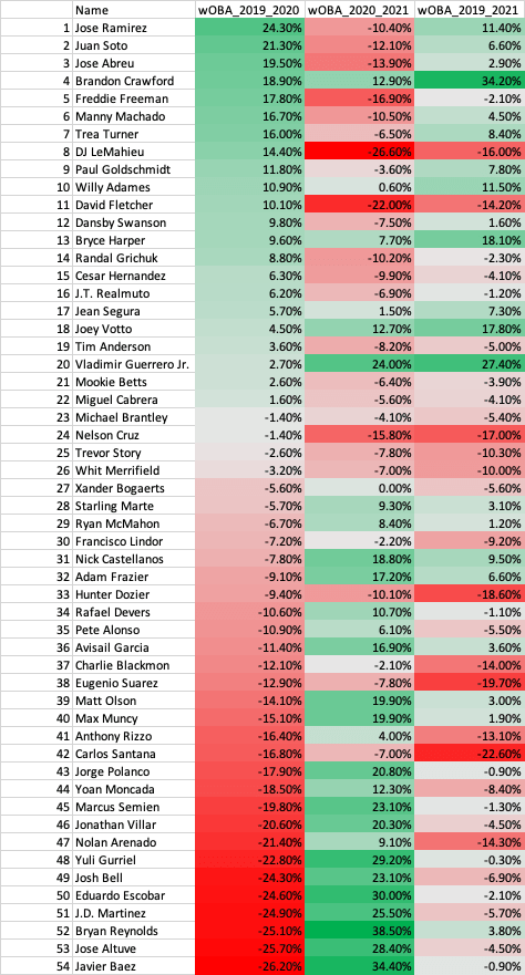
wOBA
29.6% of players increased in wOBA in 2020 and decrease in 2021.
40.7% of players decreased in wOBA in 2020 and increase in 2021.
11.1% of players increased in wOBA in 2020 and increase in 2021.
16.7% of players decreased in wOBA in 2020 and decrease in 2021.
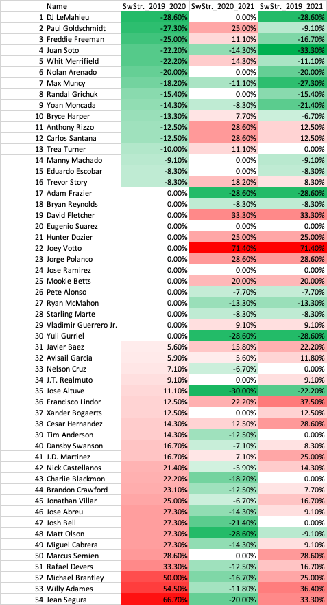
Swinging Strike %
29.6% of players increased in Swinging Strike % in 2020 and decrease in 2021
14.8% of players decreased in Swinging Strike % in 2020 and increase in 2021.
9.3% of players increased in Swinging Strike % in 2020 and increase in 2021.
5.6% of players decreased in Swinging Strike % in 2020 and decrease in 2021.
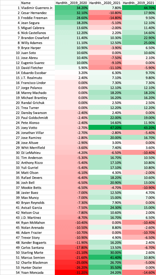
Hard Hit %
14.8% of players increased in Hard Hit % in 2020 and decrease in 2021
51.9% of players decreased in Hard Hit % in 2020 and increase in 2021.
11.1% of players increased in Hard Hit % in 2020 and increase in 2021.
5.6% of players decreased in Hard Hit % in 2020 and decrease in 2021.
fWAR
37.0% of players increased in fWAR in 2020 and decrease in 2021
40.7% of players decreased in fWAR in 2020 and increase in 2021.
11.1% of players increased in fWAR in 2020 and increase in 2021.
11.1% of players decreased in fWAR in 2020 and decrease in 2021.
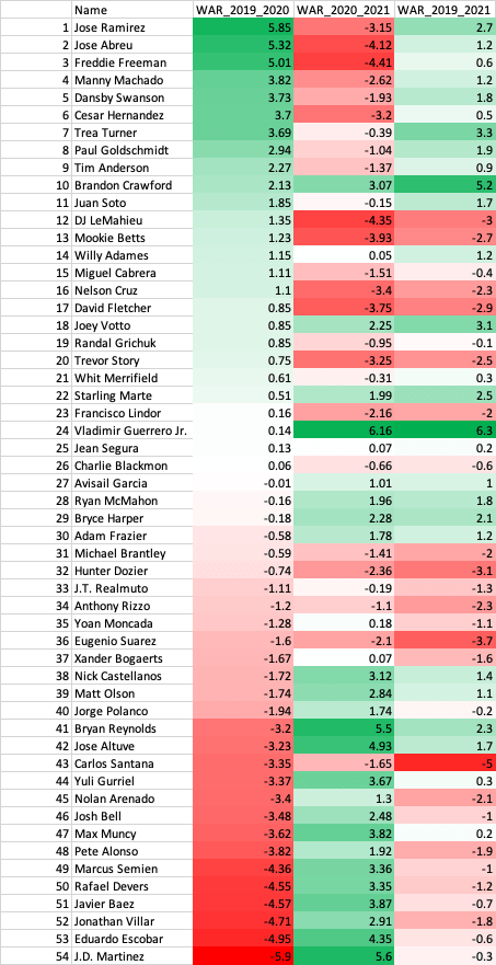
We can see that most players came back to Earth after a large increase or decrease in their performance metrics. The least impacted was swinging strike %, which is likely due to a player’s approach and eye for the strike zone not changing drastically year to year. This increase or decrease in 2020 was due to the shortened season and players regressed or bounced back to their normal performance after that. The concept of regressing towards the mean is notably in “The Book” by Tom Tango where analysis showed that after a hot streak or cold streak a player will come back to their average performance and that we needed even more than a season’s worth of data to truly assess a player. However, there were rare cases like Vladimir Guerrero Jr., Brandon Crawford, and Joey Votto that continued to improve in 2021. Looking at 2019 to 2021 paints a better picture of how these players are trending. We see players like Jose Ramirez, Juan Soto, Freddie Freeman, among others, who are trending upwards as we’d expect after watching them through the 2019 season.
Conclusion
2020 was weird for baseball, and all sports for that matter. Keep in mind this data is biased in 2020 since there was a small sample size of plate appearances per player, which probably contributed to the results of this analysis, but it is what we have. We saw that most players regressed or bounced back to their normal performance and their trajectories were more in line in 2021 with what we’d expect. Were there players that made strides in 2020 and continued in 2021? Yes, as there are always outliers, but the majority did not continue their trajectory. In general, only the elite like a Mike Trout can improve on their great seasons while most come back to their average. So, let’s go back to the question I posed at the beginning: how can we analyze player performance with such limited data in an unprecedented season? The answer is we can’t say much just using 2020 data and should include data from 2018-2019 in addition to 2020 at a minimum to have made an evaluation after the 2020 season. There probably is an optimized weighting of 2020 metrics that could be useful for analysis, but I did not explore that. Since we now have 2021 data, it is easier to evaluate a player since it was a more normal season. Initially I thought this would be a two-part post where I go into the pitching side next, but I think we’d see similar patterns. However, if you’d like me to do it let me know! As a data scientist, more data is always better and player evaluation is the most difficult part of data analytics in baseball, which made 2020 very difficult to analyze.
