AI is the hot button topic right now. More specifically Large Language Models (LLMs), like ChatGPT and Perplexity, are where all the buzz is at. Peeling the layers back for a second, these LLMs are just models that are making associations between words. What words go together? What part of the sentence is the attention focused? The best use of AI, in my opinion, is the automation of tasks to give people more time to do other things. We still must be wary though because AI is not perfect, and definitely should be used as a tool rather than a full solution.
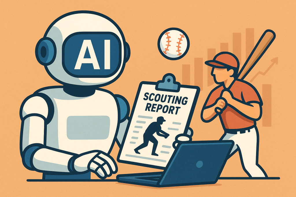
This emergence of AI in our lives made me wonder how we could apply this to baseball. Thinking about this I thought of different scenarios such as bullpen management decisions, free agency decisions, among other things. Ultimately I settled on exploring the use for scouting reports. Let me preface this by saying I am not suggesting that AI should replace scouts. There is still something to be said about a scout watching a player (video AI analysis is coming, but that is another can of worms) to see a players tendencies that the numbers would not show. However, I think in terms of game planning for an analytics team in conjunction with scouts, there is an opportunity to automate to reduce hours spent researching.
I have many thoughts about AI and its use but let’s get to baseball!
Mike Trout’s August Struggle
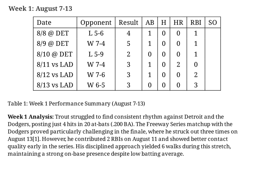
An example I am going to look at is Mike Trout’s struggle in August to build out a scouting report. Specifically I will be looking at Aug. 7 – Aug 21, 2025 where he was really struggling at the plate.
| AVG | SLG | wOBA | K% | Bat Speed |
| 0.250 | 0.275 | 0.343 | 26.4 | 70.8 |
A lot of swing and miss here and also his bat speed was down as well. There were articles about his struggle such as this one:
“Trout, however, doesn’t believe his struggles are due to distraction. He stated before the Halos’ series against the Texas Rangers he’s finding difficulty in “recognizing the pitch, just being on time.”” [https://www.si.com/mlb/angels/onsi/angels-news/angels-manager-thinks-mike-trout-is-distracted-amid-brutal-slump].
So there was a lot said as well as performance metrics to look at. Opposing analysts and scouts from opposing teams would be synthesizing this data to figure out how to attack Trout at the plate during this time. Let’s see what AI comes up with!
Prompt: Build scouting report for Mike Trout, Aug. 7 – Aug 21, 2025
ChatGPT
Mike Trout (Los Angeles Angels) – Aug. 7 – Aug. 21, 2025 Scouting Report
Overview
Veteran three-time AL MVP Mike Trout (age 34 in 2025) entered this period as a key offensive leader for the Angels but was in one of the tougher stretches of his illustrious career. Trout’s overall 2025 season numbers show he hit .232/.359/.439 with 26 HR and 64 RBI in 130 games, reflective of a solid but markedly down year by his historic standards.
Performance Summary (Aug. 7–21)
Offense
- Batting average & production: In August overall, Trout hit approximately .214 with 1 HR, 7 RBIs, and 14 runs scored over 24 games, indicating limited impact at the plate during this stretch.
- Slump indicator: According to team reports from late August, he batted just .190 with a .207 slugging percentage since Aug. 7, suggesting a notable slump during much of this period.
- Approach & timing: Trout and Angels coaching staff publicly noted struggles with pitch recognition and timing. Trout himself commented that he felt good in cage work but was “off” in game timing.
- Power: Despite the slump, Trout had hit at least one long ball (No. 398 of his career on Aug. 6), but power production was limited immediately after that milestone.
Health & Availability
- Injury context: Trout returned from a bone bruise in his surgically repaired left knee earlier in the season and had missed games, which may have affected rhythm and mobility.
- No new major injury was reported between Aug. 7–21, but ongoing knee discomfort was mentioned as a lingering issue in other late-season commentary on his form.
Advanced Metrics (Context for Period)
- Approach profile: Across 2025, Trout’s profile trended toward a high strikeout rate (~32 %) and a high percentage of three-true-outcome plate appearances (HR, BB, K), suggesting a more all-or-nothing approach that could contribute to streakiness at the plate.
- Statcast baseline: Over the full 2025 season Trout produced respectable exit metrics (avg. exit velo ≈ 90.9 mph, Hard-Hit % around 49.3 %), but those numbers were slightly down from prior peak years, which may correlate with his mid-August struggles.
Strengths Observed in This Stretch
- Professional approach: Still demonstrates elite plate discipline relative to average MLB hitters; walks remain a strong part of his game even during down periods.
- Power potential: Capable of game-changing contact and milestone power (e.g., home run No. 398 just before the period).
- Experience & baseball IQ: Leveraging veteran instincts, even when production dips.
Weaknesses / Issues
- Consistency & timing: Struggles with timing and pitch recognition were evident in decreased batting average and slugging during Aug. 7–21.
- Limiting injuries: Lingering knee issues may impact lower-half mechanics, reducing his ability to drive the ball with consistency.
- Three-true-outcome skew: Heavy reliance on walks, strikeouts, and home runs creates volatility; tough stretches can look especially barren when power is suppressed and strikeouts are high.
Role & Usage
- Primarily Designated Hitter with limited time in the field compared to earlier career phases.
- Remains a middle-of-order bat and team cornerstone, though impact was muted down this stretch.
Overall Take (Aug. 7–21)
This period was not representative of Trout’s peak performance levels. While he continued to show glimpses of power and maintained a disciplined eye, his batting average and slugging were depressed, timing was off, and production lagged relative to expectations for an elite hitter. Lingering health concerns and adjustment to a DH-heavy role likely contributed to the uneven showings. That said, his veteran approach and ability to draw walks kept value from falling further.
Although expansive analyses, ChatGPT could not hone in directly to that time period. Instead it talked about the whole month of August. Overall it is a good summary but not exactly a scouting report. Let’s look at a different LLM.
Perplexity
So perplexity gave an extensive 6 page scouting report.
Here are highlights:
- Week by week game analysis
- Summary of metrics
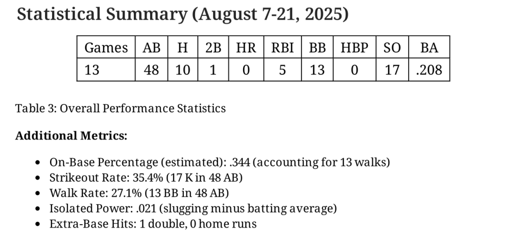
- Tool evaluation (20-80) scouting report
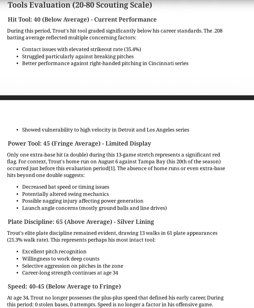
- Strengths, concerns, red flags, mechanical observations
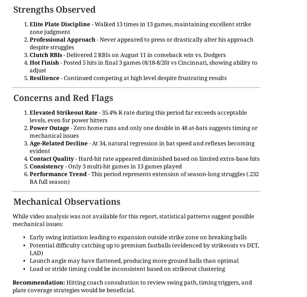
You can find the full report below
I was incredibly impressed with Perplexity with the amount of detail it gave. It did exactly what I asked (breakdown of that time period) and more. This is much closer to what a scout/analytics team would like to know for a scouting report. I did notice my numbers did not match (Yikes, I could definitely be wrong) so either human error or AI error.
I then asked an additional question: What pitches did he struggle with during this time period?
Publicly available pitch-by-pitch data is not granular enough (by date range) to isolate exactly which pitch types Mike Trout struggled with only between August 7–21, 2025, so we cannot cleanly separate that two-week window from the rest of his 2025 season by pitch type.
Over the full 2025 season, however, the underlying pattern is clear and likely applies to that stretch:
- He showed elevated whiff rates against all categories, but especially offspeed(changeups/splitters) and breaking balls (sliders and curves), with offspeed whiff/swing around 45% and breaking balls around 37% in 2025.
- Analytical reports from 2025 also note career‑high swing-and-miss rates against four-seamers, with around a 30%+ whiff rate on heaters and very poor results against sinkers, plus very high whiff rates versus sliders/sweepers (over 40% in one early‑season sample).
So while we cannot isolate Aug. 7–21 specifically, the best-supported answer is: during that period he was most vulnerable to elevated four‑seamers, sinkers below the zone, and breaking/offspeed pitches (sliders, curves, changeups/splitters), which were already the primary sources of his swing-and-miss and chase issues throughout the 2025 season.
This is where we get to limitations of AI. We can get this data via Baseball Savant, but AI cannot filter the site with a query (yet). Something to note is I have the Pro version of Perplexity but not ChatGPT which may have impacted the responses. In addition, there are whole courses on prompting and how to change it to get better results. I do not delve into that here, as I just wanted to see how they do in general. Something really cool about Perplexity is it shows you each step in the “thinking” (i.e. Where it is searching, what it is searching for, etc.) and sources.
I think AI is very exciting for the scouting world to automate processes to allow a scout/analyst to work more efficiently. Perplexity is pretty close, but it is not a scout. Training an LLM just on scouting literature could improve this, as well as better prompting (looking at myself). I’m looking forward to looking at this again during the season.
Data & AI
Special Thanks
I want to say thank you to Brad Ito, who talked through this idea with me and gave me fantastic LLM resources.