The other day I was thinking about the metric ISO (Isolated Power) which is SLG minus AVG and thought about what a metric of OBP minus AVG would tell us. Of course someone already thought of this, namely Michael Salfino of The Athletic here. It always seems like someone smarter thinks of the good ideas first but let’s take a deeper dive into the 2023 data.
So what does this Isolated OBP (ISO OBP) actually tell us? Well it gives us a measure of how much a player depends on hits to get on base. This means the lower the ISO OBP the more dependent on hits the player is to get on base. Hits have a lot of randomness to them so they are not as reliable as a hitter’s eye at the plate to get on base. A player could be in a slump at the plate but still get on base due to their ability to get a walk. Ideally a leadoff hitter would have a higher ISO OBP.
Let’s dig into the data!
Name
BA
OBP
ISO
ISO OBP
1
Kyle Schwarber
0.191
0.335
0.274
0.144
2
Ryan Noda
0.239
0.381
0.181
0.142
3
Juan Soto
0.261
0.401
0.228
0.140
4
Matt Carpenter
0.174
0.314
0.129
0.140
5
Max Muncy
0.205
0.333
0.280
0.128
6
Jose Caballero
0.227
0.355
0.095
0.128
7
Jack Suwinski
0.206
0.333
0.236
0.127
8
Aaron Judge
0.265
0.392
0.362
0.127
9
Joey Gallo
0.173
0.300
0.257
0.127
10
Andrew McCutchen
0.250
0.373
0.138
0.123
Data was taken from Baseball Reference as of 8/30/23 of hitters with at least 200 PAs
Looking at the top 10 in ISO OBP we see players we’d expect like Juan Soto, Aaron Judge, Kyle Schwarber, and Max Muncy with superior plate discipline. We also see the three true outcome (homerun, walk, strikeout) players in Kyle Schwarber and Joey Gallo. Of these players, 6 out of 10 have led off this season.
We can see that if we take ISO (Isolated Power) into consideration there are players with very weak ISO but high ISO OBP. In an ideal world you’d like to maximize both and you get players like Schwarber, Soto, Muncy and Judge. I believe that these are your ideal leadoff hitters because they get on base via a walk and when they hit the ball it is likely that extra bases are involved. There could be an argument to be made that batting them second (like Judge for example) is the best because they can drive in more runs. To which I’d argue that if you don’t have a hitter in front of them that has a high ISO OBP then you will not have as many runners in front of them over the course of the season. The ability to drive runners in is a different story for a different blog post.
The Moneyball adage is getting on base leads to wins. Higher ISO OBP shows a hitter has a good eye and will get on base without depending on a hit. Ideally you maximize both ISO and ISO OBP for a leadoff hitter but a high ISO OBP should lead to more times on base in the long run.
Generally having two strikes is favorable for the pitcher. Hitters are hitting 0.171 in 2023 with two strikes but the Angels are giving up a BA of 0.187. For an 0-2 count it is tougher with hitters hitting 0.151 but the Angels are giving up a league worst 0.209 BA. The question is simple: Why? I dig into the data to see if there is anything we can find from it.
Methodology
Data was taken from Baseball Savant of all two-strike counts that led to an outcome (hit/out) for Angels pitchers through June 5th, 2023.
Results
Location
Here is a reference to the zones I will be referencing:
From Baseball Savant
First I looked at where the pitchers are throwing the baseball in two strike counts.
zone
count
14
155
13
117
5
111
8
76
4
74
6
74
12
70
11
64
9
62
7
61
2
57
3
55
1
53
The top two zones are low and away/outside but shockingly third and fourth on this list are middle/middle and middle/down. Pitching in the heart of the plate is obviously not good, and a pitch being down goes right into the swing path of a hitter in this launch angle revolution.
Here is how things look on an 0-2 count:
zone
count
14
53
13
22
4
20
6
15
7
15
12
15
5
13
9
12
2
10
3
10
8
10
11
10
1
7
The first two are the exact same as two strike counts so it seems the philosophy is to try to get a hitter to swing and miss something down low. Though middle/middle (zone 5) isn’t third here, 4 & 6 are middle/in or out.
Unsurprisingly, with two strikes the hits are mostly when the location is zone 5 but on 0-2 it is zone 14. Seemingly the ball is not getting down enough in zone 14.
Pitch Type
Now let’s look at pitch type in two strike counts.
pitch_type
count
FF
269
SL
250
CH
239
ST
100
CU
55
FC
45
FS
35
SI
32
KC
4
So in a two strike count they are throwing a four-seam fastball the most followed by the slider.
Let’s look at 0-2
pitch_type
count
FF
52
SL
50
CH
47
ST
24
CU
13
FS
11
FC
8
SI
6
KC
1
Similar story here, with four seam fastballs being thrown the most. The majority of hits on 0-2 are sliders followed by the four-seam fastball.
Pitch Type + Location
We’ve looked at pitch type and location separately but now let’s slice the data by both (looking at the top 10), starting with two strikes.
pitch_type
zone
count
CH
14
55
SL
14
42
FF
11
41
SL
13
40
CH
13
36
FF
5
35
ST
14
34
FF
12
32
CH
8
31
FF
2
31
There is a clear trend here of throwing a changeup or slider down in the zone an a fastball up/in or outside. However, 35 pitches were middle/middle four seam fastballs!
Let’s look at 0-2
pitch_type
zone
count
CH
14
18
SL
14
14
ST
14
12
SL
13
10
FF
12
9
FF
3
8
FF
4
7
FF
11
7
CH
8
6
CH
13
6
Similar story here but no middle/middle fastball. Interestingly, the slider and changeup low/outside or inside resulted in the most hits on 0-2
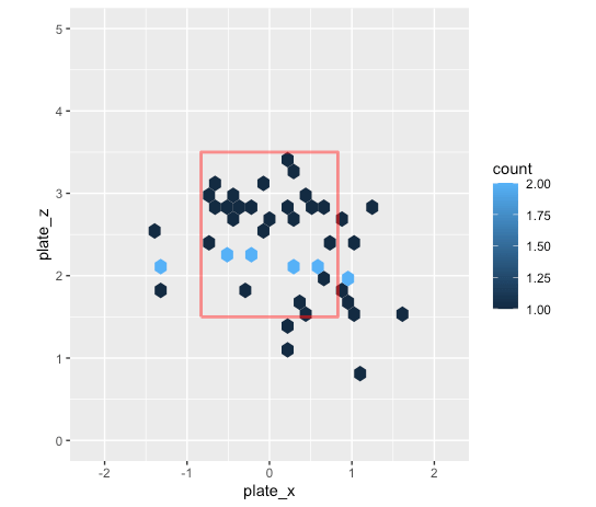
Visualizing Two-Strike Hits
Lastly, let’s take a look at the location of two strike hits.
Of course the middle of the plate is showing up the most, but a large majority are in the strike zone, and if they aren’t they are close to the strike zone.
Conclusion
So what does this all mean? Unsurprisingly, middle/middle fastballs and sliders are punished but there is a clear pitching philosophy to get hitters out down in the zone rather than up in the zone. This leads to a higher possibility of bloop hits with higher launch angles. A confounding variable here is pitch sequencing, which could be an issue as well but beyond the scope of this post. I am no pitching coach but I think the Angels need to try to get hitters out more up with the fastball and also get the ball lower or more lateral movement out of the strike zone.
It will come down to execution, and I hope they can turn this around.
For the 2023 season MLB will be banning the infield shift. This ban is supposed to increase action on the field, which in this case more hits is the goal. This post looks into what a potential impact would be and which players will be most affected.
Methodology
The idea here is very simple, but we need to be careful with interpretation as you’ll see. This came from something I saw from Sisu, who coined impact. What we do is take the average of the variables of interest (in this case batting average), take the average after removing a certain category of a variable (in this case when the infield alignment is in a shift), and find the difference.
What I don’t like about this technique is that many people will think “impact” means “causation” when it actually is an association analysis. The reason why is that we are removing rows of data, which eliminates interactions between variables that may be there and are actually causing changes in output. For example, we are not taking something like quality of contact into account. It could be that the quality of contact has a larger effect on success. I think there is still value in the simplicity of this analysis but CORRELATION DOES NOT MEAN CAUSATION. If you want more causal analysis, I would go with a machine learning model or hypothesis testing. Rant over, now let’s get into it!
Data
What is the shift supposed to take away? Baseballs that are pulled and on the ground. With this in mind, the data taken for this analysis are all pulled ground balls for the 2022 season.
Results
Overall
Note that the following batting averages correspond to just pulled baseballs on the ground in 2022.
Batting Average (All)
Batting Average (No Shift)
Impact of Shift
0.191
0.222
-0.031
So what does this mean? Well on average, the impact of the shift is -0.031 in batting average. This is about 3 less hits per 100 baseballs pulled on the ground. This really doesn’t sound like much in my opinion, but again this is an association and not causal analysis so maybe there is a larger impact than shown here.
Player Level
Now let’s look at which players were the most affected, in terms of impact, by the shift. For this I looked at only players that were shifted on 20+ times in the 2022 season and were also not shifted against (at least once) which resulted in 154 players.
Players Most Negatively Affected By the Shift
Name
Batting Average (All)
Batting Average (No Shift)
Impact of Shift
Joey Gallo
0.071
0.500
-0.429
Joey Votto
0.127
0.500
-0.373
Byron Buxton
0.146
0.500
-0.354
Eddie Rosario
0.081
0.429
-0.348
Mike Moustakes
0.069
0.400
-0.331
Jose Ramirez
0.340
0.650
-0.310
Joc Pederson
0.250
0.500
-0.250
Brad Miller
0.160
0.400
-0.240
Salvador Perez
0.208
0.400
-0.192
Ozzie Albies
0.167
0.353
-0.186
Not surprising that Gallo is at the top but hitters like Votto and Ramirez might be a little surprising. Something to note is that the sample size was less than 10 for the top 5 players for pulled ground balls when not shifted on, meaning that it was rare they weren’t shifted on, which is a confounding variable in this case. Still interesting nonetheless and these players should benefit from the shift being banned. Now let’s look into players that did well beating the shift.
Players Most Positively Affected By the Shift
Name
Batting Average (All)
Batting Average (No Shift)
Impact of Shift
JJ Bleday
0.12
0
0.12
Max Kepler
0.1
0
0.1
Mitch Haniger
0.194
0.1
0.094
Michael Perez
0.091
0
0.091
Michael Massey
0.086
0
0.086
Matt Olson
0.135
0.059
0.076
Mitch Garver
0.2
0.125
0.075
Jake Fraley
0.15
0.091
0.059
Rougned Odor
0.055
0
0.055
Brett Phillips
0.042
0
0.042
As you can see, the top positive effects are much smaller than the top negative effects. This means that they managed to beat the shift but really not much difference. Again, sample size of non-shifted ABs is in here as well. Olson is very interesting to me because in Oakland he pulled the ball very often. An extra fun fact is that Shohei Ohtani was 11th, just missing the top 10 cutoff, meaning he was not affected as much.
Conclusion
The shift being banned should have a high association for more pulled ground balls for certain hitters becoming hits but overall we might not see as much impact as we thought. Time will tell though! For what it is worth, I liked the shift because it is just using data to make more informed decisions to take away hits but many would disagree and that is okay too. I have always been interested in a shift based on the pitcher, rather than a hitter, so I think I will look at that next time.
For years Taylor Ward had been up and down from the major league level and could not gain consistency. Ward then turned himself from an average major leaguer last season (turning it on in the second half) into an above average major leaguer. Before the 2022 season his career bWAR was -0.4 and he is already at 2.3 bWAR this season. Absolutely incredible jump and, if healthy, will be an All Star. Let’s dive into some stats!
Statistics
Year
Barrel %
Avg Exit Velo
Launch Angle
wOBA
OPS+
BB %
Chase %
Whiff %
2021
10.3%
89.6 MPH
16.4°
0.333
108
8.4%
25.1%
25.1%
2022
18.4%
89.5 MPH
13.2°
0.500
212
17.6%
16.6%
21.8%
Taylor Ward Statistics
Overall, his number have drastically improved, as seen by the wOBA and OPS+. He isn’t hitting the ball much harder, but his lower launch angle is resulting in better contact. In addition, he improved his chase % by nearly 9%. Clearly his approach at the plate is better and a mechanical adjustment was made.
So his overall metrics have gotten better but now I want to dive deeper into his at bats.
At Bats
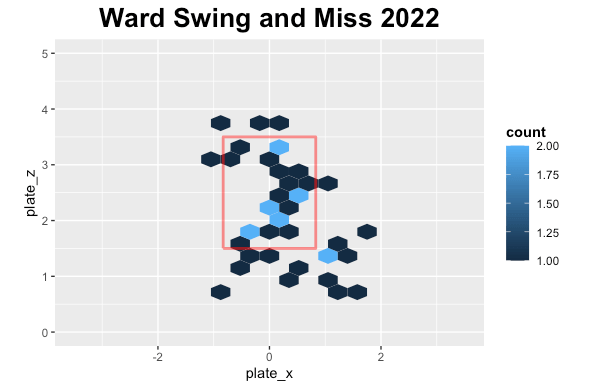
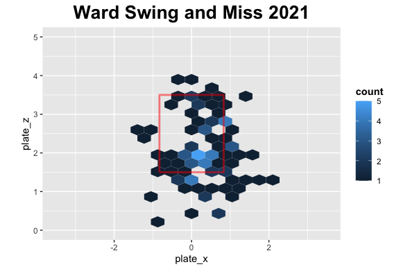
First, let’s look at his swing and misses.
It is early in the season, so we don’t have as much data as last season but in 2021 there were a lot of swing and miss low while this season similar story but more around the plate.
Let’s look at the counts he has swung in.
Count Analysis
Ward 2021 Swings
Count
Frequency
Percentage
0-0
76
18.5%
2-2
60
14.6%
0-1
51
12.4%
1-1
42
10.2%
1-0
36
8.8%
0-2
34
8.3%
1-2
32
7.8%
3-2
28
6.8%
2-1
25
6.1%
3-1
13
3.2%
2-0
12
2.9%
3-0
2
0.5%
Ward Swings 2021
Ward 2022 Swings
Count
Frequency
Percentage
0-0
34
16.2%
1-1
34
16.2%
2-2
28
13.3%
1-0
22
10.5%
3-2
19
9.0%
0-1
16
7.6%
1-2
16
7.6%
0-2
15
7.1%
2-1
14
6.7%
2-0
8
3.8%
3-1
3
1.4%
3-0
1
0.5%
Ward Swings 2022
Ward is continuing to swing a lot at the first pitch in 2022 and there isn’t really a huge discernable difference from 2021. He has been quoted that the count doesn’t matter and his approach changed in an article from The Athletic: Ward Article
“The count … it doesn’t matter,” Ward said. “Just waiting for the ball to show up in the spot. That’s all that matters. No count. No lineup. It doesn’t matter. I’m just in the box, doing my thing. Don’t think about it at all.”
From Sam Blum, The Athletic
Now I will look at his hits in different counts.
Ward 2021 Hits
Count
Frequency
Percentage
0-0
15
28.8%
0-1
6
11.5%
1-1
6
11.5%
1-0
5
9.6%
1-2
5
9.6%
0-2
4
7.7%
2-2
4
7.7%
3-2
4
7.7%
2-0
2
3.8%
3-1
1
1.9%
Ward 2021 Hits
Ward 2022 Hits
Count
Frequency
Percentage
1-1
9
22.5%
3-2
6
15.0%
0-1
5
12.5%
2-2
5
12.5%
0-0
4
10.0%
1-2
3
7.5%
0-2
2
5.0%
1-0
2
5.0%
2-0
2
5.0%
3-1
2
5.0%
Ward 2022 Hits
In 2021 the majority of his hits were on the first pitch while in 2022 they are spread out, seemingly from his new approach.
Lastly, I wanted to look at the type of contact he is making and where the ball is going.
Contact Type Analysis
Ward Contact 2021
Contact Type
Frequency
Percentage
Ground Ball
60
38.5%
Fly Ball
46
29.5%
Line Drive
43
27.6%
Pop Up
7
4.5%
Ward Contact 2021
Ward Contact 2022
Contact Type
Frequency
Percentage
Ground Ball
30
35.7%
Fly Ball
27
32.1%
Line Drive
23
27.4%
Pop Up
4
4.8%
Ward Contact 2022
Ward Directional Statistics
Year
Pull %
Center %
Opposite Field %
2021
39.1%
29.5%
31.4%
2022
45.4%
30.9%
23.7%
Ward Directional Statistics
Ward is putting the baseball in the air a tiny bit more and his ground ball percentage is a little less so far this season. We do see a major shift to pulling the baseball more and hitting it less to the opposite field, which is resulting in his higher power numbers.
Conclusion
Taylor Ward has improved drastically in all offensive categories. His approach at the plate has had a huge impact on his output this season. Analytics only tells you what is happening and what needs to be fixed, but it is up to the player to do it. We are seeing someone successfully changing his approach and becoming an all-star caliber player. Hopefully he can stay healthy and carry these numbers through the rest of the season.
We saw in the previous post that there were quite a few differences when a hitter whiffs versus when they don’t. The data was sliced and diced in many ways like the count, state, and pitch. In this post I will be getting into some data science discussing a Naïve Model, which is basically just slicing and dicing the data and taking averages. For those data scientists out there it’s a very simple decision tree approach. The inspiration for this comes from a talk I saw at last year’s SABR Analytics conference where a Markov Chain approach was done. This inspired me to think that based on the variables we have we could find a probability that an event will happen. I used this approach to answer a question on a data questionnaire as part of the process for a baseball analytics position in baseball operations for the New York Mets. Unfortunately, did not get the position but was told the approach beat the other models submitted by a large margin. Got to the final round but a las, they went a different direction. I cannot say what that question was because of an NDA but will say that it was not the same as predicting whiffs, so I am not breaking any rules here.
Let’s get started!
Methodology
I will be using the exact same data set I used in the previous blog. However, I built one more variable called ‘platoon’ which is a value of True when there is a platoon advantage (i.e. Hitter and pitcher opposite handedness) and False otherwise.
The goal of this is to predict the probability of a whiff. Let’s get into a little data science. To do this I first split the data into a training and testing data set. Where 80% of the original data is in the training set and 20% is in the testing set. Alternatively, you could do 5-fold cross-validation [generally would do this but didn’t make as much sense here and going for simplicity]. The reason we split the data like this is because when a model is run for prediction it is on unseen data. Something to note is that the data is imbalanced, but not that bad. There is ~32% whiffs and the other ~68% is contact. Since we are predicting a probability rather than a true classification problem (Predicting a whiff or not. Either it happened or didn’t.) this is ok. One may argue it is fine for classification as well but that is an argument for another time. If you didn’t follow this, it is okay! Don’t necessarily need to know this. Time to slice and dice the training data set.
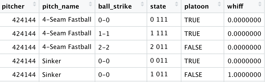
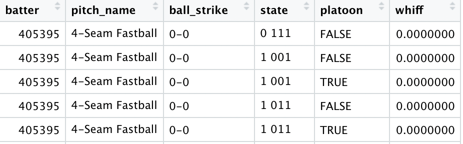
The first portion of this is the pitcher side where I will build a data set grouping by the pitcher, pitch name, count, baseball state, and platoon to get every combination. The second portion of this is the hitter side where it will be the same as previously mentioned but grouping by the hitter instead of the pitcher. Here is what they look like:
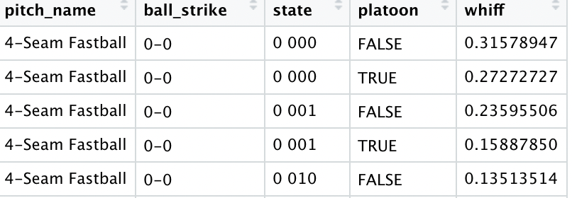
Then I grouped by pitch name, count, baseball state, and platoon. The reason for this is if a pitcher, hitter or both aren’t in the data sets built above this will break the model. Here is what it looks like.
The last thing that I did was group by just count in case a pitch name, count, baseball state, and platoon combination was in the training set but not the test set.
Model
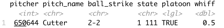
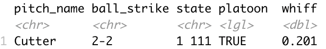
The model structure itself is simple at its core but could be confusing. If you find it too confusing feel free to jump ahead to results. Basically, we take the pitcher and hitter grouped data sets based on the pitcher and hitter respectively and find the corresponding probability and average them. If either the pitcher or batter don’t exist, we just use the one that does exist and data without pitcher or hitter. However, if both don’t exist, we will just use the grouped data without the pitcher and hitter. If the doesn’t exist, we take the data set just grouped by count. Confused? Let’s take an example.
Say we have this scenario
Pitcher
Hitter
Pitch Name
Count
State
Platoon
650644
518735
Cutter
2-2
1 111
True
The batter data set doesn’t exist but the pitcher one does so we take that as one data point.
Then we take the data set without the pitcher or batter.
Then our final prediction is a (0.5+0.201)/2 = 0.3505 probability of a whiff.
Okay even I admit that is a lot. If you’ve made it this far, awesome! Let’s get into some results.
Results
I evaluated how well the model did with three metrics: MAE (Mean Absolute Error), accuracy (Over 50% probability is a predicted whiff), and AUC (Area Under Curve). For MAE, closer to a value of 0 is better and it measures how far on average the predictions were off by. Accuracy is the percentage of correct predictions assuming over a 50% probability is a predicted whiff. Finally, AUC (Area Under the Curve) measures how well a model fits the data with closer to 1 being better. I compared across several different model combinations and chose the best one.
Here are the results on predicting whiffs on the test set:
MAE
Accuracy
AUC
0.346
72.4%
0.58
But what about class imbalance!? Yes there is some class imbalance, but this is why I calculate AUC.
Conclusion
I showed a simple at its core (yet confusing) decision tree model to predict a whiff, but is it good? The answer is yes, but why? Well, if we randomly simulated data from 0 to 1 and calculated metrics MAE would be 0.5 and accuracy 50%. So, this model performed about 44.5% better than chance in MAE and 22.4% better than chance in accuracy, and 16% better in AUC. There could very well be a better combination of variables out there that does better but what I find the most interesting is that sometimes the simple things are surprisingly good.
Everyone loves the whiff (also known as swinging strikes). Coaches, front offices, scouts, agents. Pitchers that don’t have good numbers on the surface but a high whiff % continue to get opportunities in MLB. Why? Well whiffs are an indicator of success for pitchers, especially relievers. If the bases are loaded with no outs, we’d want a strikeout rather than contact because a run can be scored on contact, even if it leads to an out. This will be a multipart series, starting with this one on the analytics and will go into modeling in subsequent parts. The goal is to find variables that influence whiffs and predict whiffs.
Finding the probability of a swing and miss can be done in a couple ways. We can be given that a hitter has swung or not. We will assume that the hitter has swung. For those probability lovers out there, assume event A is a swing and event B is a whiff. P(A and B) = P(A)P(B|A) from conditional probability. We will be focusing on P(B|A), the conditional probability that a hitter whiffed given they swung. Can argue back and forth about our assumption of a swing but the goal of this is not to determine what influences a swing, just that they whiff so I think this is the most logical way of going about it. Word of caution, there is some statistics here (exciting!) but do not fear I will break it down in simple terms!
Methodology
For this analysis I took data of every swing in 2021 from Baseball Savant. This was quite tedious because the limit for exporting data from Baseball Savant is 40,000 rows and the number of swing events was 334,881. So I meticulously took a couple weeks of data at a time resulting in 12 data sets and combined them together to get the full data set. I created a variable that is True when it was a whiff (swinging strike or swinging strike blocked) and False otherwise. Just as a glimpse into the issue data scientists must deal with, there were pitch types and pitch names that were empty like ” ”, which is different than an empty type which is NA/Null, so I had to fix that. I also made a variable for the ball-strike count and baseball state (i.e. 1 100 is 1 out runner on 1st). With this, the analysis can begin.
Results
We will slice and dice the data to look at whiff % in different aspects of the game. A simple group by for those data analyst out there. These are very simple but glean nice insights.
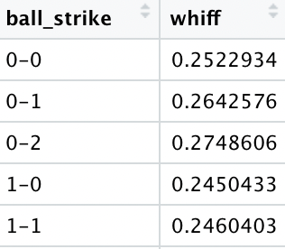
Let’s start simple with just the probability of a whiff (given a swing of course).
Whiff %
24%
If a hitter swings, there is a 24% chance of a whiff.
We will now start to group by certain variables. First, by pitch name (without unknown pitch types).
Pitch Name
Whiff %
Split-Finger
36.2%
Slider
33.9%
Knuckle Curve
32.1%
Curveball
30.9%
Changeup
28.5%
Cutter
22.0%
4-Seam Fastball
19.4%
Knuckleball
14.7%
Sinker
13.9%
Eephus
11.5%
Fastball
7.4%
Screwball
0.0%
Breaking it down by pitch we see a split-finger induces the most whiffs followed by a slider and knuckle curve. A couple things to note are that there was only 1 screwball recorded and fastball corresponds to 2-seam I believe. I asked about it, but haven’t heard back from Baseball Savant. However, the 2-seam fastball doesn’t show up anymore so I assume it is now just called fastball but maybe wrong on that.
Next, we will group by ball-strike count.
Count
Whiff %
0-2
27.2%
0-1
26.5%
1-2
25.6%
0-0
25.1%
1-0
24.5%
1-1
24.5%
2-1
22.1%
2-2
22.1%
2-0
21.7%
3-1
18.6%
3-2
18.0%
3-0
16.0%
To probably no one’s surprise, when being ahead of the count a pitcher will induce a whiff more often. What I find interesting is that 0-0 counts are 4th on this list which means that many times a pitcher won’t just throw a fastball down the middle for the first pitch. An indicator of a changing game.
Baseball state is up next. For those who are unfamiliar, there are 24 states a baseball game can be in during an inning. These are the combinations of outs and strikes. The first number will indicate the number of outs, and the the following 3 values will indicate runners on first, second, and third with a 1 indicating the base is occupied. For example, 1 010 would indicate 1 out and a runner on second base.
State
Whiff %
2 100
26.8%
2 001
26.1%
2 101
25.9%
2 010
25.8%
2 111
25.7%
2 110
25.7%
2 000
25.6%
0 000
25.6%
1 110
25.5%
1 100
25.4%
2 011
25.4%
1 001
24.7%
1 111
24.6%
1 101
23.8%
1 000
23.7%
0 100
23.7%
0 110
23.1%
1 011
23.0%
1 010
22.5%
0 001
22.4%
0 111
22.3%
0 010
22.2%
0 011
21.8%
0 101
21.3%
The top 5 states where whiffs were the highest were with two outs and runners on base. This isn’t entirely surprising as hitters are more aggressive to get runs in and pitchers are trying to avoid contact.
Finally, let’s explore both ball-strike count and baseball state together. I will spare you looking through 288 scenarios and just give you the top 10.
State
Count
Whiff %
0 110
3-0
44.4%
0 100
3-0
40.0%
1 010
3-0
33.3%
2 100
0-2
32.8%
0 100
0-2
32.3%
0 000
0-2
32.1%
0 000
2-0
32.1%
2 100
0-1
31.5%
1 001
2-0
31.3%
0 000
0-0
30.7%
Looking at the top 10 we see two trends. One is that on a 3-0 count and runners on hitters seem to be aggressive and whiff. Two, on an 0-2 count hitters must protect and pitchers don’t necessarily have to throw a strike.
We can go down a rabbit hole of grouping by more variables and get more and more specific. This will be the foundation for part 2 of this analysis which is sort of a naïve decision tree type model, but I will not spoil the surprise right now.
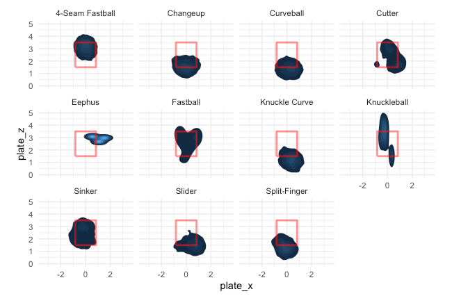
Let’s look at another important aspect, pitch location by pitch type.
For this plot, the lighter the blue the more pitches in that area. This is from the catcher’s perspective. We can see clear trends that changeups and curveballs down as well as 4-seam fastballs up induce whiffs.
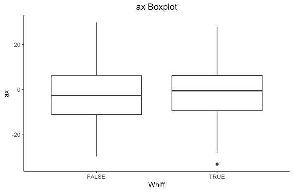
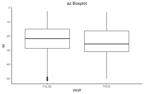
What else could influence a whiff? Let’s look at accelerations in the x direction (left/right, ax), and in the z direction (up/down) az.
From the boxplot we see there is a different in medians for both plots. Statistically we can compute a t-test to see if there is a statistical difference in means. (For other R fans out there, I will be using t.test()). If we get a p-value less than 0.05 we have a statistically significant difference. If you are not well versed in statistics don’t worry, in simple terms it means the difference is actually a difference and not likely due to chance.
Welch Two Sample t-test
data:
swings[swings$swing_miss_tf == TRUE, "ax"] and swings[swings$swing_miss_tf == FALSE, "ax"]
t = 24.839, df = 143574, p-value < 2.2e-16
alternative hypothesis: true difference in means is not equal to 0
95 percent confidence interval:
0.9366943 1.0971813
sample estimates:
mean of x mean of y
-1.306053 -2.322991
Welch Two Sample t-test


data:
swings[swings$swing_miss_tf == TRUE, "az"] and swings[swings$swing_miss_tf == FALSE, "az"]
t = -57.324, df = 130076, p-value < 2.2e-16

alternative hypothesis: true difference in means is not equal to 0

95 percent confidence interval:
-2.166112 -2.022884
sample estimates:
mean of x mean of y

-24.67372 -22.57922
There is a statistical significance in both cases. In statistics language we can say that we reject the null hypothesis that there is no difference in means of ax and az based on if a hitter whiffs in favor of the alternative that there is a difference. Based on the confidence interval, we see that ax is higher when a hitter whiffs (positive is running right from the catchers perspective) and az is lower when a hitter whiffs (negative is dropping down). In simple terms, there is a difference that isn’t due to just chance.
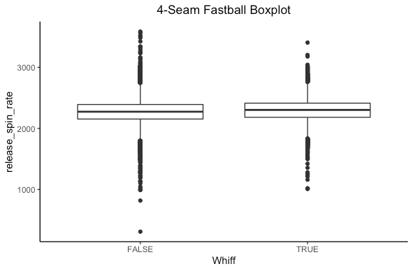
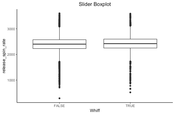
Let’s repeat this for the spin rate of a 4-seam fastball and slider.
We see some sort of difference but not as clear here. What we need is more statistics!
Welch Two Sample t-test

data:
swings[swings$swing_miss_tf == TRUE & swings$pitch_name == "4-Seam Fastball", "release_spin_rate"] and swings[swings$swing_miss_tf == FALSE & swings$pitch_name == "4-Seam Fastball", "release_spin_rate"]
t = 19.642, df = 35360, p-value < 2.2e-16
alternative hypothesis: true difference in means is not equal to 0
95 percent confidence interval:
 23.38357 28.56781
sample estimates:
mean of x mean of y
 2297.987  2272.012
Welch Two Sample t-test

data:
swings[swings$swing_miss_tf == TRUE & swings$pitch_name == "Slider", "release_spin_rate"] and swings[swings$swing_miss_tf == FALSE & swings$pitch_name == "Slider", "release_spin_rate"]
t = 9.94, df = 43948, p-value < 2.2e-16

alternative hypothesis: true difference in means is not equal to 0
95 percent confidence interval:
17.44415 26.01333
sample estimates:
mean of x mean of y
 2429.844  2408.115
Turns out there is a statistically significant difference in both cases. For the statistically inclined, we reject the null hypothesis that the mean spin rates are the same for 4-seam fastballs and sliders based on if a hitter whiffs in favor of the alternative that there is a difference. Based on the confidence intervals for both pitches, the spin rate is higher when a hitter whiffs. This makes sense, as higher spin rates have been shown to induce whiffs.
Conclusion
We see there are plenty of differences based on if a hitter whiffs. In this post we explored pitch type, pitch count, baseball state, baseball state + count, pitch location, accelerations, and spin rate. There certainly are more, and if I had unlimited time I could show more but also that would be an extremely long blog post. So I encourage you to explore more if you are interested! Now that we know there are differences, we can build models to predict a whiff. Next time I will be looking at a naïve model, which is inspired by Markov Chains (the probability of getting to the next state only depends on the current state) but is basically a decision tree.
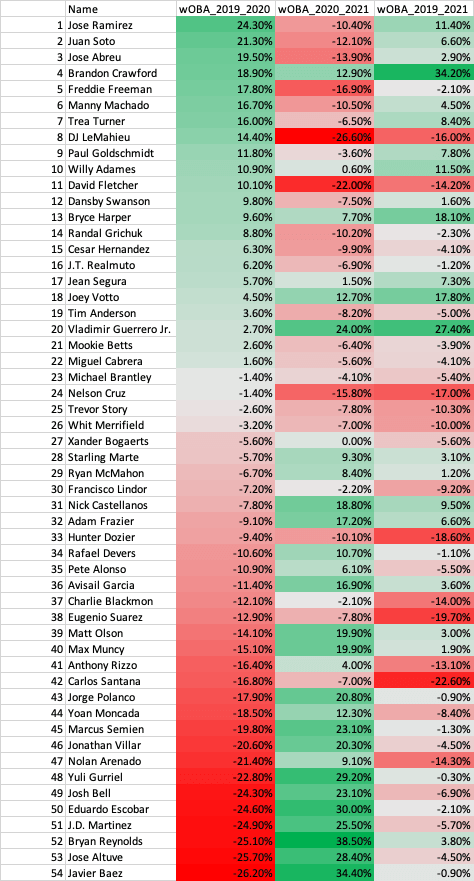
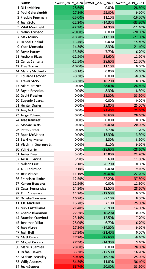
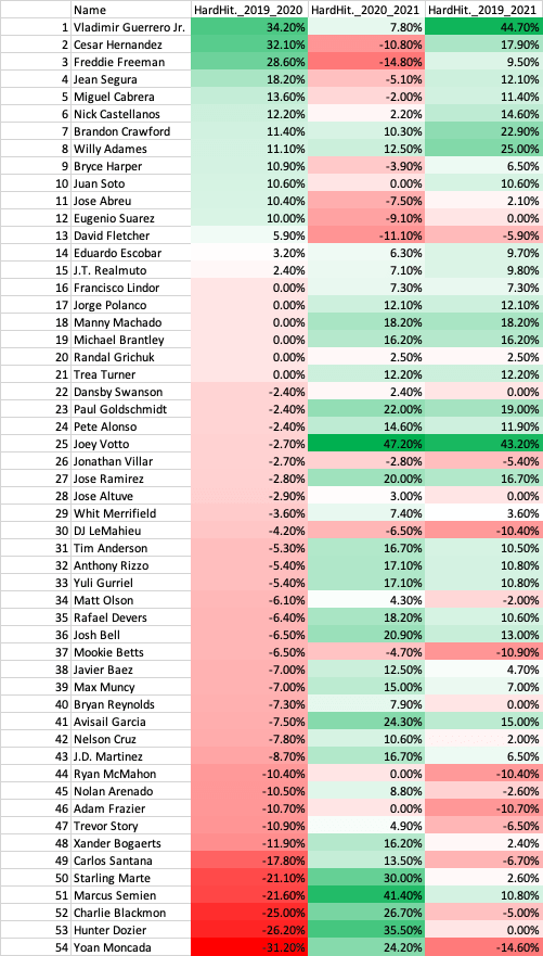
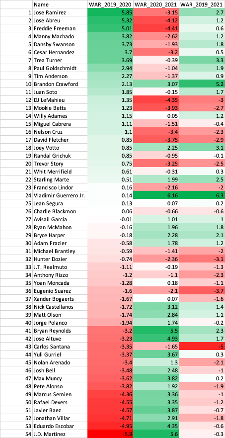
The 2020 season was one of the strangest MLB seasons in history. A 60-game season starting in late July, no fans, social distancing measure for players, and no high fives due to COVID-19. A big question going into the 2020 off-seasons was how can we analyze player performance with such limited data in an unprecedented season? Many high-profile players struggled in 2020 while some unknowns made big strides. With the 2021 season completed, we can look back to see which performances were an anomaly in 2020 and which were signs of a continuation in 2021. In this post I analyze 2020 batter performance.
Metrics
With so much data available in baseball there are a bevy of metrics that one could choose to analyze players. I picked four: wOBA, fWAR (Fangraphs WAR), Swinging Strike %, and Hard Hit % to evaluate overall performance, value, contact ability, and quality of contact. Yes, I could have chosen different metrics and there is always a debate on what is the best, but I decided on these. For fWAR in 2020 I multiplied it by 2.7 to scale it to a full 162 (since 162/60 = 2.7). Of course, this is an estimation but the best we have for that season.
Methods
I took data via Fangraphs of qualified hitters in 2019, 2020, and 2021. For wOBA, Swinging Strike %, and Hard Hit % I looked at the percent change between 2019-2020, 2020-2021, and 2019-2021 while for fWAR just the differences for those time periods (since fWAR can be negative). To assess the impact of 2020, we must look at 2019, 2020, and 2021. Sharp improvements or declines in metrics in 2020 could have been due to the nature of the season, thus I explored 2019, 2020, and 2021 (had to be qualified in 2019, 2020, and 2021) which resulted in 54 players. Due to injuries, among other things, this caused the decline in the number of players in the data set. Could I have made the criteria less strict for the data set? Absolutely, but then we have smaller sample sizes (in this case plate appearances) for players. Always pros and cons but for this analysis I took qualified players over those three seasons.
Results
Below I will show tables with differences between 2019-2020, 2020-2021, and 2019-2021 seasons.
wOBA
29.6% of players increased in wOBA in 2020 and decrease in 2021.
40.7% of players decreased in wOBA in 2020 and increase in 2021.
11.1% of players increased in wOBA in 2020 and increase in 2021.
16.7% of players decreased in wOBA in 2020 and decrease in 2021.
Swinging Strike %
29.6% of players increased in Swinging Strike % in 2020 and decrease in 2021
14.8% of players decreased in Swinging Strike % in 2020 and increase in 2021.
9.3% of players increased in Swinging Strike % in 2020 and increase in 2021.
5.6% of players decreased in Swinging Strike % in 2020 and decrease in 2021.
Hard Hit %
14.8% of players increased in Hard Hit % in 2020 and decrease in 2021
51.9% of players decreased in Hard Hit % in 2020 and increase in 2021.
11.1% of players increased in Hard Hit % in 2020 and increase in 2021.
5.6% of players decreased in Hard Hit % in 2020 and decrease in 2021.
fWAR
37.0% of players increased in fWAR in 2020 and decrease in 2021
40.7% of players decreased in fWAR in 2020 and increase in 2021.
11.1% of players increased in fWAR in 2020 and increase in 2021.
11.1% of players decreased in fWAR in 2020 and decrease in 2021.
We can see that most players came back to Earth after a large increase or decrease in their performance metrics. The least impacted was swinging strike %, which is likely due to a player’s approach and eye for the strike zone not changing drastically year to year. This increase or decrease in 2020 was due to the shortened season and players regressed or bounced back to their normal performance after that. The concept of regressing towards the mean is notably in “The Book” by Tom Tango where analysis showed that after a hot streak or cold streak a player will come back to their average performance and that we needed even more than a season’s worth of data to truly assess a player. However, there were rare cases like Vladimir Guerrero Jr., Brandon Crawford, and Joey Votto that continued to improve in 2021. Looking at 2019 to 2021 paints a better picture of how these players are trending. We see players like Jose Ramirez, Juan Soto, Freddie Freeman, among others, who are trending upwards as we’d expect after watching them through the 2019 season.
Conclusion
2020 was weird for baseball, and all sports for that matter. Keep in mind this data is biased in 2020 since there was a small sample size of plate appearances per player, which probably contributed to the results of this analysis, but it is what we have. We saw that most players regressed or bounced back to their normal performance and their trajectories were more in line in 2021 with what we’d expect. Were there players that made strides in 2020 and continued in 2021? Yes, as there are always outliers, but the majority did not continue their trajectory. In general, only the elite like a Mike Trout can improve on their great seasons while most come back to their average. So, let’s go back to the question I posed at the beginning: how can we analyze player performance with such limited data in an unprecedented season? The answer is we can’t say much just using 2020 data and should include data from 2018-2019 in addition to 2020 at a minimum to have made an evaluation after the 2020 season. There probably is an optimized weighting of 2020 metrics that could be useful for analysis, but I did not explore that. Since we now have 2021 data, it is easier to evaluate a player since it was a more normal season. Initially I thought this would be a two-part post where I go into the pitching side next, but I think we’d see similar patterns. However, if you’d like me to do it let me know! As a data scientist, more data is always better and player evaluation is the most difficult part of data analytics in baseball, which made 2020 very difficult to analyze.
My favorite machine learning algorithms are unsupervised clustering. I think there is elegance in finding patterns in data that we don’t know about. Clustering is grouping similar data together in a data set when the groupings are unknown. This is based on how far away data points are from other groups and how close they are to other data points in their group. In layman’s terms, you are like your group but different from other groups. As an example, let’s think about cats and dogs. There are many different types of dogs, but they are all similar because they are all dogs. Same for cats, many types but all cats. However, cats are different than dogs, thus are different animals. There are many more technical insights into clustering, but this is the idea. Once we get clusters, since groupings are unknown, we use a domain expert to determine what these groups represent.
I may be wrong because I’ve never worked in a front office, but I believe clustering is underutilized in the baseball industry. It is such a powerful tool that can lead to many discoveries. From a team perspective, we can identify undervalued players that are like superstars in the game and at a cheaper price. From an agency perspective, we also identify undervalued players to target, as well as potential superstars at the high school, college, and minor league level. Of course, with any machine learning algorithm, it’s never a guarantee but it can glean insights that we may not be aware of. There are many questions as to which variables to use, from what time period our data comes from, and many other data questions that need to be taken into consideration but I will keep it simple.
Methodology
For this analysis I took starting pitchers that had 100+ innings pitched in 2021, which resulted in 115 starting pitchers. Each variable used in clustering adds a dimension to the data. For example, if we have three variables then the data lives in three dimensions. Obviously for four or higher we cannot visualize the data but also the data gets further apart, thus not as good clusters. I decided on three metrics: WAR, Swinging Strike %, and Barrel %. It is up for debate if these are the best to use and there very well could be a better combination, but I decided on these because they exemplify a pitcher’s value, swing and miss ability, and how well they limit hard contact.
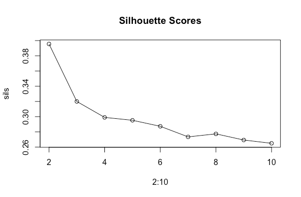
The clustering technique I will be utilizing is called k-means. This algorithm clusters the data into k groups. The difficulty with this algorithm is that we must choose a k value to run it. So how do we choose k? Well sometimes it is chosen with domain knowledge if the number of groups is known already and other times we use a metric to determine the best k value. In this case I will be utilizing a mix of domain knowledge and a metric. The metric I will use is called a silhouette score, where a value closer to 1 indicates better clustering. A silhouette score considers how close data is to their own cluster (cohesion) and how far away they are from other clusters (separation). For k from 2-10 I will calculate the silhouette score, and I will repeat this 10 times and average them to avoid variation caused by randomness. When clustering, we always scale the data because the algorithm is distance based.
We have all the tools, let’s cluster!
Clustering
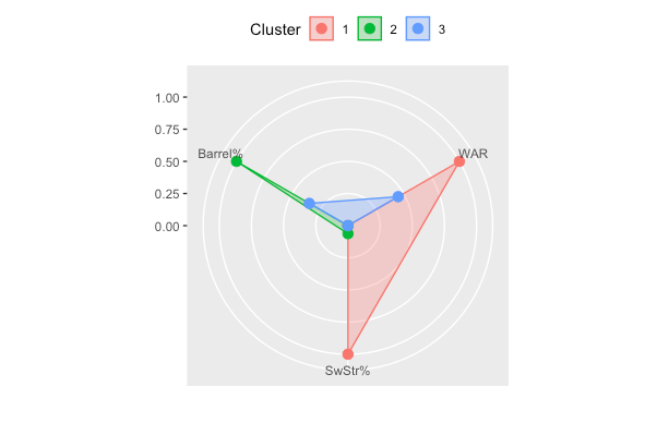
From the silhouette scores, the best option is two clusters with a value of 0.396. However, there are more than two types of pitchers in the league so I will go with three, which had a value of 0.32. Neither of these scores are great, as they are far from 1, but real data is never like in textbooks. Here are the averages of the metrics per cluster.
Cluster
WAR
Swinging Strike %
Barrel %
1
3.67
0.131
0.068
2
0.989
0.101
0.094
3
2.19
0.099
0.077
Results
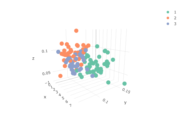
Since we have only three variables, we can visualize the data in a 3D plot and see the separation of clusters.
x: WAR, y: Swinging Strike %, z: Barrel %
Another neat way of visualizing the groups and analyzing them is a radar plot. It shows what variables are the largest signals for each group.
Cluster 1
Cluster 1 (in red) is the group of elite pitchers. They have a high WAR and Swinging Strike % while limiting hard contact with a low Barrel %. Here are the pitchers in Cluster 1.
Name
WAR
Swinging Strike %
Barrel %
Cluster
Carlos Rodon
4.9
0.15
0.066
1
Corbin Burnes
7.5
0.166
0.031
1
Max Scherzer
5.4
0.159
0.08
1
Walker Buehler
5.5
0.116
0.068
1
Brandon Woodruff
4.7
0.129
0.058
1
Trevor Rogers
4.2
0.141
0.05
1
Lance Lynn
4.2
0.12
0.057
1
Zack Wheeler
7.3
0.124
0.046
1
Kevin Gausman
4.8
0.153
0.071
1
Robbie Ray
3.9
0.155
0.098
1
Freddy Peralta
3.9
0.144
0.057
1
Marcus Stroman
3.4
0.116
0.065
1
Logan Webb
4
0.124
0.056
1
Pablo Lopez
2.3
0.118
0.074
1
Lance McCullers Jr.
3.3
0.116
0.053
1
Shohei Ohtani
3
0.129
0.071
1
Sandy Alcantara
4.2
0.133
0.061
1
Alek Manoah
2
0.126
0.058
1
Gerrit Cole
5.3
0.145
0.098
1
Joe Musgrove
3.2
0.127
0.074
1
Charlie Morton
4.6
0.124
0.049
1
Frankie Montas
4.1
0.137
0.087
1
Shane McClanahan
2.5
0.148
0.107
1
Kyle Gibson
3.1
0.104
0.045
1
Lucas Giolito
4
0.153
0.067
1
Clayton Kershaw
3.4
0.167
0.069
1
Luis Garcia
3.1
0.132
0.07
1
Tyler Mahle
3.8
0.114
0.065
1
Nathan Eovaldi
5.6
0.126
0.063
1
Alex Wood
2.5
0.125
0.053
1
Jordan Montgomery
3.3
0.137
0.074
1
Dylan Cease
4.4
0.148
0.099
1
Sean Manaea
3.3
0.123
0.08
1
Luis Castillo
3.7
0.131
0.045
1
Sonny Gray
2.4
0.106
0.047
1
Yu Darvish
2.9
0.121
0.088
1
Jameson Taillon
2
0.122
0.082
1
German Marquez
3.4
0.121
0.053
1
Aaron Nola
4.5
0.128
0.071
1
Kenta Maeda
1.7
0.136
0.063
1
Logan Gilbert
2.2
0.125
0.088
1
Eduardo Rodriguez
3.8
0.117
0.068
1
Brady Singer
2
0.102
0.056
1
JT Brubaker
0.3
0.12
0.088
1
Andrew Heaney
1.2
0.127
0.093
1
We see the top starting pitchers like NL CY Young award winner Corbin Burnes, AL CY Young award winner Robbie Ray, Max Scherzer, Kevin Gausman, Shohei Othani, and others. Some up-and-coming talent like Alex Manoah, Logan Webb, and Logan Gilbert are also a part of this group. There are many interesting names in this group, but a couple of names stand out here as surprising are JT Brubaker and Andrew Heaney. These players are not known as elite yet are in this group. Does this mean they will be elite? Not necessarily, but the metrics indicate they could be. This is a big reason why the Yankees last season and Dodgers this season took a chance on Heaney. They have the tools to be elite but could be a steal for a team.
Cluster 2
Cluster 2 (in green) are the underachievers with low WAR and Swinging Strike % and allow a lot of hard contact with a high barrel %. Here are the pitchers in Cluster 2.
Name
WAR
Swinging Strike %
Barrel %
Cluster
Trevor Bauer
1.8
0.126
0.106
2
Framber Valdez
1.9
0.102
0.058
2
Adrian Houser
1.5
0.07
0.05
2
Ian Anderson
1.9
0.119
0.095
2
Casey Mize
1.3
0.094
0.1
2
Rich Hill
1.6
0.098
0.088
2
James Kaprielian
1.3
0.11
0.094
2
Marco Gonzales
0.6
0.091
0.114
2
Joe Ross
1.3
0.111
0.09
2
Blake Snell
2.1
0.129
0.11
2
Zac Gallen
1.5
0.091
0.079
2
Jake Odorizzi
1
0.094
0.096
2
Tarik Skubal
0.8
0.111
0.143
2
Yusei Kikuchi
1.1
0.125
0.11
2
Taijuan Walker
1.2
0.095
0.102
2
Austin Gomber
1.3
0.113
0.094
2
Dane Dunning
1.8
0.1
0.08
2
Nick Pivetta
2.1
0.106
0.082
2
Jon Gray
2.3
0.11
0.069
2
Jon Lester
0
0.087
0.077
2
Vladimir Gutierrez
0.6
0.096
0.084
2
Drew Smyly
0.2
0.118
0.108
2
Martin Perez
0.5
0.08
0.094
2
Kris Bubic
-0.1
0.089
0.099
2
Triston McKenzie
1.1
0.124
0.1
2
Adbert Alzolay
0.4
0.115
0.11
2
Dallas Keuchel
0.7
0.086
0.091
2
Garrett Richards
0.4
0.094
0.093
2
Erick Fedde
1.1
0.089
0.09
2
Brad Keller
1.1
0.091
0.109
2
Jordan Lyles
-0.2
0.105
0.096
2
Wil Crowe
-0.3
0.105
0.095
2
Zach Davies
0.1
0.09
0.091
2
J.A. Happ
0.5
0.081
0.116
2
Patrick Corbin
0.2
0.112
0.092
2
Mitch Keller
1.1
0.082
0.068
2
Jorge Lopez
0.8
0.082
0.093
2
We see some names that aren’t surprising like Dane Dunning, Drew Smyly, Wil Crowe, and others. Also, there are pitchers who took a step back like Yusei Kikuchi, Jake Odorizzi, and Blake Snell. Several surprises in here but a couple that stand out are Martin Perez and Trevor Bauer. Martin Perez got a long-term deal with the Tigers but was in this group. Bauer’s WAR was affected not playing the entire season but his Barrel % was high, which contributed to him being in this group.
Cluster 3
Cluster 3 (in blue) are the average performers for the season. Not the best but not the worst WAR, Swinging Strike %, and Barrel %. Here are the pitchers in Cluster 3.
Name
WAR
Swinging Strike %
Barrel %
Cluster
Julio Urias
5
0.112
0.053
3
Eric Lauer
1.8
0.105
0.07
3
Max Fried
3.8
0.111
0.063
3
Adam Wainwright
3.8
0.081
0.062
3
Cal Quantrill
1.8
0.089
0.07
3
Chris Bassitt
3.3
0.101
0.065
3
Anthony DeSclafani
3
0.11
0.081
3
Wade Miley
2.9
0.101
0.061
3
Jose Berrios
4.1
0.099
0.091
3
Chris Flexen
3
0.086
0.063
3
Jose Urquidy
1.8
0.118
0.093
3
John Means
2.5
0.119
0.101
3
Michael Pineda
1.3
0.104
0.091
3
Steven Matz
2.8
0.094
0.07
3
Aaron Civale
0.8
0.094
0.082
3
Johnny Cueto
1.5
0.097
0.066
3
Zack Greinke
1.4
0.091
0.066
3
Zach Eflin
2.2
0.102
0.068
3
Cole Irvin
2.1
0.089
0.073
3
Kyle Freeland
1.5
0.085
0.082
3
Hyun-Jin Ryu
2.5
0.097
0.085
3
Antonio Senzatela
3.5
0.086
0.059
3
Merrill Kelly
2.4
0.088
0.063
3
Tyler Anderson
2.1
0.115
0.085
3
Michael Wacha
1.5
0.115
0.097
3
Zach Plesac
1.1
0.112
0.094
3
Madison Bumgarner
1.5
0.096
0.075
3
Kyle Hendricks
1.3
0.089
0.084
3
Mike Minor
2.3
0.107
0.093
3
Chris Paddack
1.8
0.112
0.085
3
Ryan Yarbrough
0.9
0.096
0.078
3
Mike Foltynewicz
-0.8
0.08
0.096
3
Matt Harvey
1.9
0.08
0.079
3
There are some players that make sense like Johnny Cueto, Zack Grienke, and Hyun-Jin Ryu. A few surprises in here like Matt Harvey and Julio Urias for different reason. We’d expect Harvey in Cluster 2 while Urias would have been expected in Cluster 1.
Conclusion
We can clearly see differences in groups and identified players that are undervalued and even possibly overvalued. There could very well be a better combination of metrics to use and even could employ other clustering techniques. The beauty of machine learning is that there is always another way to do something that could be an improvement, and the fun part is finding it. Clustering is not perfect, and we saw with the silhouette scores that it definitely wasn’t perfect in this case, but clustering is still very useful to group players to see what insights there could be.
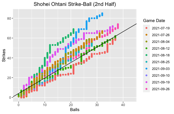
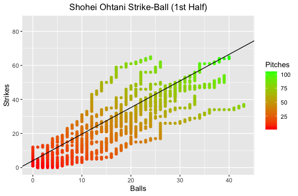
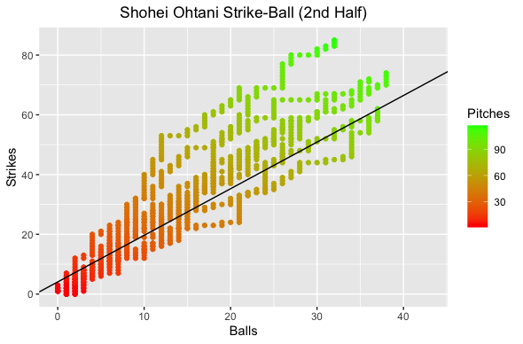
For as good as Shohei Ohtani is at the plate, his ability on the mound is arguably his best tool. His devastating splitter strikes fear in hitters around the league. Oh yeah, he also can hit 100 MPH on his fastball. He gets 100 MPH exit velocity off the bat and can throw 100 MPH, truly amazing. With the Angels letting Shohei hit for himself in games that he pitched in 2021, this led to a roll of the dice depending on how deep into the game he pitched. It made sense since he is a better hitter than anyone else that they could put in the DH spot but if he did not pitch deep into the game the Angels could possibly run out of position players to hit in the pitcher’s spot. When everything worked it was fantastic, but when it didn’t it was difficult. The key for Shohei pitching deep into games was his command. When his strike-to-ball ratio was bad, he could not pitch deep into games. To explore this I will use a technique I saw years ago in a Sloan Conference Research paper: “Bullpen Strategies For Major League Baseball” (https://www.sloansportsconference.com/research-papers/bullpen-strategies-for-major-league-baseball) by Harrison Willie and John Salmon. They use the strike-to-ball ratio to figure out when to pull a pitcher, but I will just be using their plotting technique plus regression to assess control for Shohei. Thought the technique used was a great way to visualize how well a pitcher is doing, specifically with command. Now let’s analyze Shohei.
Command
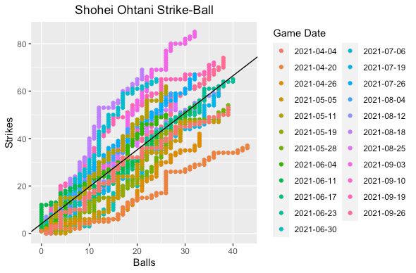
I took pitch level data from BaseballSavant for this analysis. Unfortunately, they do not have a variable tracking the number of strikes, balls, or total pitches for a pitcher so I just engineered the variables myself. I plotted the data where the number of strikes were on the y-axis and the number of balls on the x-axis. I built a linear regression (line solid black and formula below) to find Shohei’s average strike-to-ball ratio. In simple terms, games where Shohei is above this line are good and below are bad. Games along or close to that line was average for him.
Strikes = 4.07 + 1.56*Balls
The plot on the left shows Shohei’s strike-to-ball ratio on the game level while the right color codes the number of pitches Shohei threw. What I noticed right away on the game level was that most of the games he was above average occurred in the second half of the season. This is no surprise, as anyone who watched Shohei (including myself) noticed he struggled mightily with command to start the season. On the pitch level we can see that for games that were above average he generally got to a higher pitch count. Let’s compare the first and second halves of the season.
Now we can clearly see the differences in the first and second halves of the season. Clearly in the second half he had a much better strike-to-ball ratio in more games. So, we have established that Shohei had better command as the season progressed, but what changed? Although pitching was always my favorite position, I am not qualified to be a pitching coach nor am I in sports science. Thus, I cannot comment on the pitching mechanics changes Shohei implemented over the course of the season. BaseballSavant does have release positions, velocities, and accelerations but did not to go this route. Maybe a future blog post. I decided to look at something I noticed watching him pitch, fastball (four-seam + two-seam) velocity and splitter velocity.
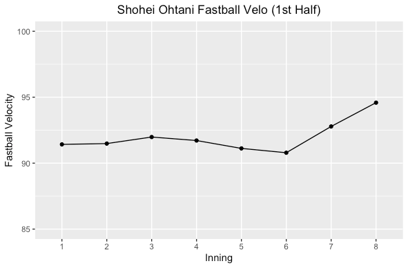
Fastball
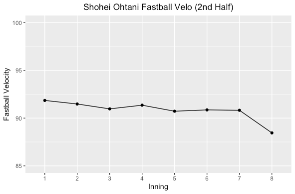
The first thing I did was look at Shohei’s average fastball velocity by inning in the first and second halves of the season.
Shohei had a slightly lower fastball velocity over the course of a game in the second half of the season but not a huge difference. He kept up a fairly consistent velocity, but in the first half of the season in the 7th and 8th he increased velocity while it declined in the second half. Could have been by design for better command but he was doing so much every day, so fatigue was probably a factor. Not much difference though, but let’s look at his splitter.
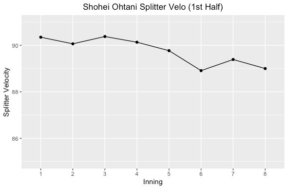
Splitter
This is where things get really interesting. In the first half Shohei’s average splitter velocity started above 90 MPH and decreased as the game went on. The second half of the season he started at a lower velocity and increased it after the 5th inning, but not getting to 90 MPH on average. Was it for command? Could be, or by design the lower velocity helps make his fastball better with a larger differential (average fastball minus splitter velocity).
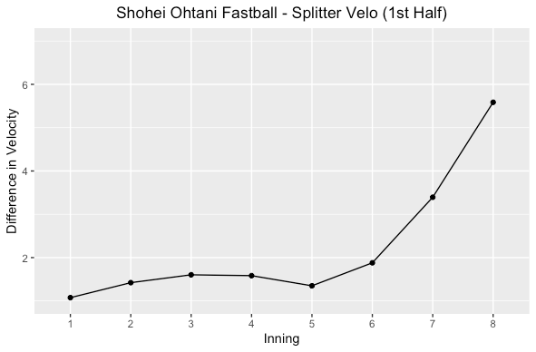
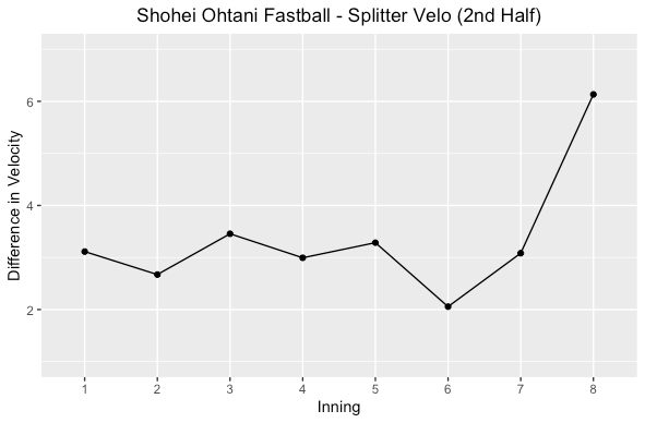
Fastball & Splitter Velocity Differential
In the first half of the season Shohei had a low differential in fastball and splitter velocity on average. Both halves showed increased differential later in the game. The more differential, the more effective at getting swing and misses he is. More swing and misses mean more strikes and finishing off hitters earlier in the at bat. Watching him in the first half, he didn’t really get a lot of swing and misses on his splitter but in the second half he got more.
Conclusion
We can conclude that Shohei’s change in fastball and splitter velocity led to better command in the second half, right? Not quite, need more statistical analysis to make that claim. Correlation never means causation and there could be many other factors that influenced this like mechanics changes, pitching to contact, better command of the slider, use of the cutter, or other things. Whatever it may have been, Shohei showed better command in the second half and thought this was an interesting observation. Truly lucky to witness his historic season in 2021 and excited to see what he does in 2022!
To kick off this blog I had to do something with my favorite team, the Angels. My friends and family would say I am obsessed but I will say passionate is the better word. Missed only one home opener the last 15+ years and going to 20+ games every year while having to follow every moment either at the ballpark, on TV, radio, Twitter, or the MLB AtBat app. Just love baseball and supporting the Angels, even though it has been a struggle recently. The 2021 Angels season was all about witnessing the historic season by AL MVP winner Shohei Ohtani. He dominated on both the mound and in the batter’s box. I have never witnessed one player do all that he did, and we all just expected greatness whenever he was on the field. For part 1 I focus on an aspect of Shohei the batter, and in part 2 the pitcher.
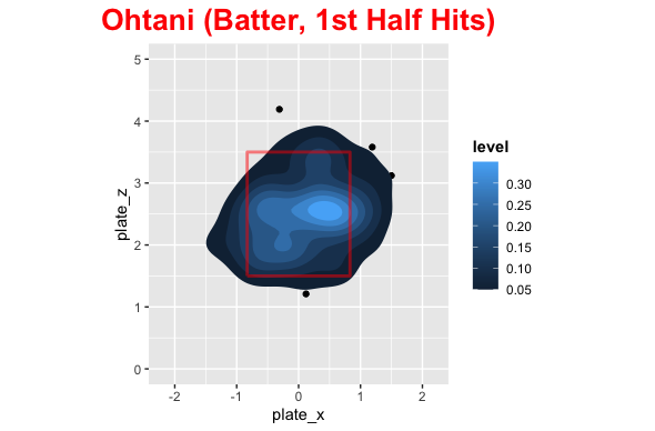
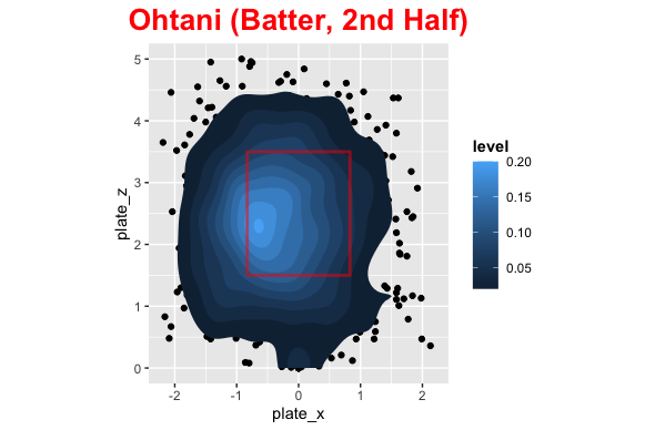
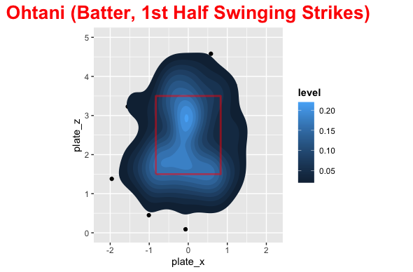
Shohei was fantastic in the batter’s box slugging 46 home runs, 152 wRC+, and 0.964 OPS. However, in the second half of the season he struggled, especially in August. In the second half his SLG went down over 200 points, but he actually increased his OBP with the high number of walks he received. This was a product of how pitchers were attacking him, a little impatience with no protection, and pulling the baseball more. Going from Mike Trout to Phil Gosselin (Goose!) hitting behind you is quite drastic. Pitchers were attacking Shohei very differently in the first and second half, which is what I wanted to explore. In addition, the distribution of pitches for swing and misses versus hits, and pull percentage were different as well. Let’s see how different it was.
NOTE: To visualize pitch locations, I will be using a heatmap that will show the magnitude of the number of pitches in each location. In simple terms, the lighter the blue the more pitches were in that area. The strike zone is in red, and the view is from the catcher’s perspective.
First Half
Pull %
Center %
Opposite %
43.1%
31.9%
25%
Shohei Ohtani first half
In the first half of the season the distribution of pitch locations was fairly uniform around the strike zone with most pitches being middle down in the zone. This is probably biased with being ahead of the count. Shohei’s swinging strikes were concentrated middle up and down and outside. He dominated at about belt level across the plate with most of his damage on the inside part of the plate. The distribution of where he hit the baseball was pretty spread out with center + opposite field being higher than pull.
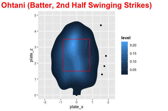
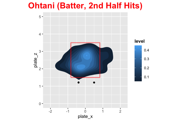
In the second half pitchers attacked Shohei on the outside part of the plate with pitchers going way down and in more than the first half. His swing and misses were up and outside as well as down and in. The hits were middle up a little and down and outside, due to how he was pitched. Shohei became much more of a pull hitter in the second half as well and pitchers were exploiting this.
Comparison
Here are some images that make it easy to compare the 1st and 2nd half for Shohei.
Conclusion
Ok so the distribution of pitches was quite different in the first and second half, so what? Well, we can clearly see that pitchers exploited the pull mentality by pitching him outside more and without protection they could try below the strike zone to get him to chase. For 2022 with Trout behind him (Or even Rendon), pitchers cannot do what they did in the second half and Shohei can be patient. He will need to get back to being less of a pull hitter, which probably stemmed from frustration not getting pitches to hit, but he is set up to perform more like his first half offensive numbers next season with protection behind him.